The SaaS Cohort Analysis Model Every Founder Needs (Excel Template Included) - Master the Metric That Makes or Breaks Your Pitch
How to track retention, revenue durability, and payback without drowning in pointless metrics.
The Slide That Stops You Cold
If you’ve ever been in a fundraising meeting with a VC, you know the question that freezes the room.
“Can you show me retention by cohort?”
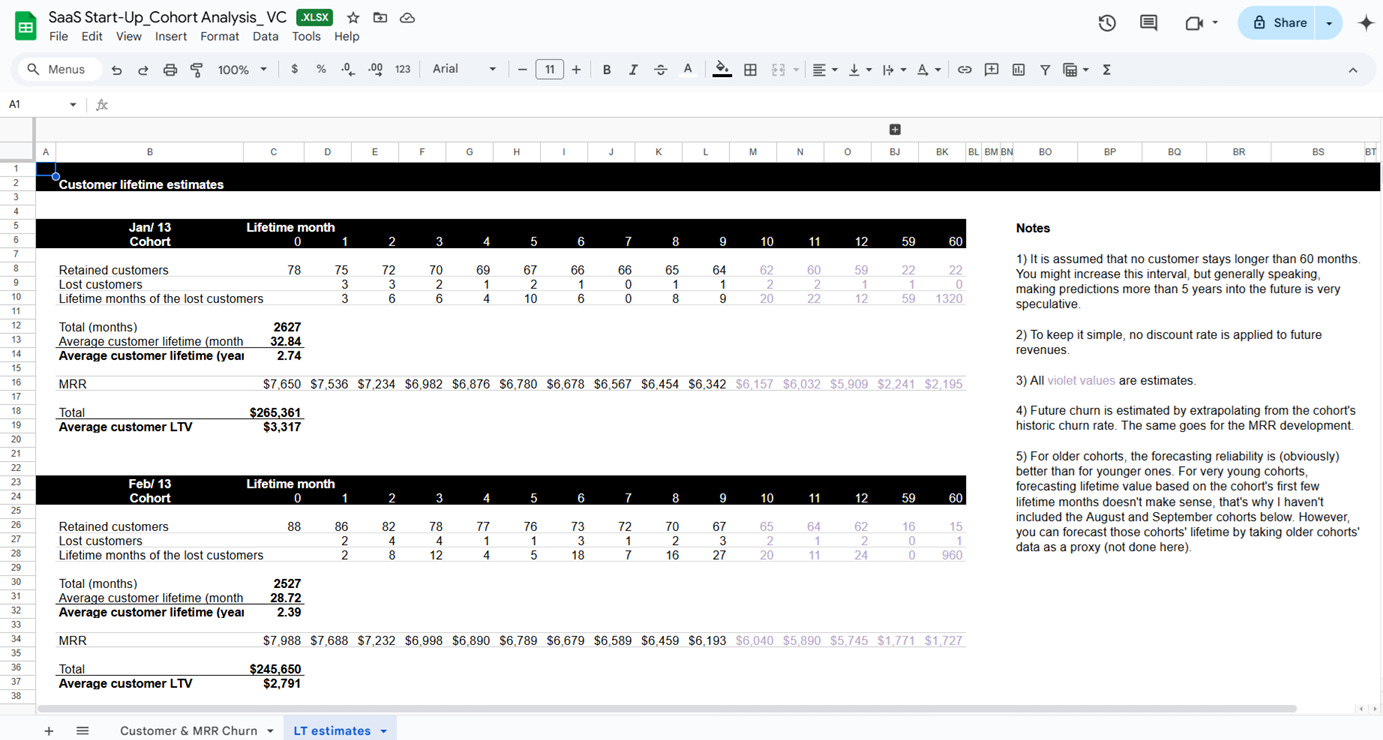
It doesn’t matter if your monthly recurring revenue (MRR) is growing 15% month over month. Unless you can prove customers stick around, investors will see a leaky bucket…
Averages can lull you into false comfort, hiding the fact that one cohort may be thriving while another is collapsing. That’s why serious operators rely on SaaS cohort analysis to separate real durability from artificial growth. This guide shows you how, with an Excel template you can use today.
Table of Contents
1. What is the SaaS Start-Up Cohort Analysis Model?
2. Why This Model Matters
3. What’s Inside (the tabs & KPIs)
4. How to Use It (3-Step Workflow)
5. Who Should Use It (and When)
6. Frequently Asked Questions (FAQs)
1. What is the SaaS Start-Up Cohort Analysis Model?
Cohort analysis is one of the most important tools in a SaaS leader’s toolkit. Instead of looking at customer retention or churn in the aggregate, you group customers into cohorts, most commonly by the month they first started paying, and then track how those groups perform over time.
The goal is simple: to see not just how many customers you have today, but how long they stay, how much revenue they generate, and how their behavior changes compared to other cohorts.
Think of it like this: in January, you signed up 80 new customers. By February, 70 are still active. By Month 6, maybe only 42 remain. That single line of data tells you more about product stickiness than a broad “10% monthly churn” metric ever could.
Averages flatten the story while cohorts surface it.
Why Monthly Cohorts Matter
SaaS businesses live and die by retention. But aggregate metrics often create illusions.
For example, your overall churn rate might look steady at 6% monthly. That sounds manageable. But once you break it into cohorts, you see January’s customers churned at 20% by Month 3, while April’s customers only churned 8%.
What could’ve cost this? Perhaps you shipped an onboarding flow in March that made adoption smoother. Without cohorts, you’d never spot the improvement, or the problem.
This is why investors, operators, and boards care so much about seeing cohorts in fundraising decks. It’s the difference between showing growth built on shaky ground and proving that new customers are sticking around long enough to compound.
The Model: Plug-and-Play Clarity
The SaaS Start-Up Cohort Analysis Model is a plug-and-play Excel workbook designed to give you these insights without requiring a data science team. It takes the messy, complicated math behind retention and presents it in a way founders can actually use.
But what makes this model especially unique, is its emphasis on visual clarity. Each tab includes tables and heatmaps that highlight the exact points where customers are being retained and where they are churning.
Everything is immediately obvious due to the colouring. You’ll know which cohorts are healthy and which require attention.

2. Why This Model Matters
At first glance, SaaS growth looks straightforward. If your MRR is climbing every month, you’re winning, right?
Well, not necessarily.
In reality, MRR can rise while retention collapses underneath. Marketing keeps adding new customers, masking the fact that older ones are churning out in droves. This is the illusion of growth, and it’s exactly what SaaS cohort analysis is designed to cut through.

Revenue Illusions: Growth That Isn’t Durable
Imagine your dashboard shows MRR growing 15% month over month. You are convinced that’s momentum. But once you dig into cohorts, you quickly realize you’ve been mistaken. Here’s what you’ll notice:
Your January cohort retained only 35% of customers by Month 6.
Your February cohort dropped below 50% by Month 4.
Meanwhile, the March cohort performed better, holding 70% at Month 6.
Averages usually hide the first two red flags. Cohorts surface them.
Without this view, you risk building a SaaS business that looks good in the short term but is unsustainable in the long run. A real SaaS churn model goes beyond today’s revenue by testing whether you have staying power.
Here’s exactly what this model provides for you:
Retention Tracking: See exactly how many customers from each monthly cohort are left in Month 1, Month 3, Month 6, and beyond.
Churn Diagnosis: Visualize where drop-offs are happening with color-coded heatmaps.
Revenue Analysis: Track MRR retained per cohort, not just headcount, so you can see if expansions offset churn.
LTV and Lifetime: Calculate average customer lifetimes and revenue generated before churn.
CAC Payback: Compare acquisition costs against cumulative revenue by cohort to see when (or if) you break even.
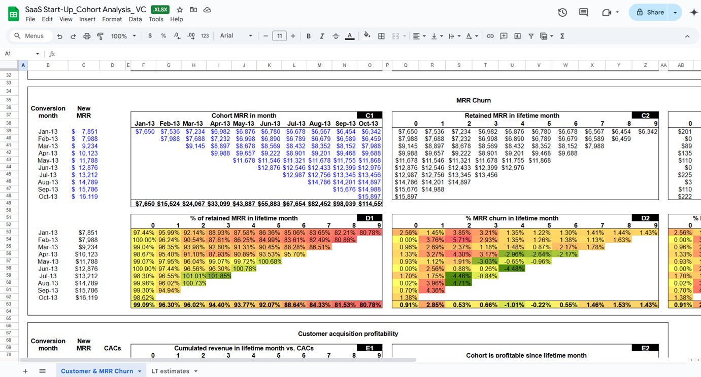
All of this is automated. You paste in your new customer counts, ARPU, and CAC, and the model builds the tables and charts. The result is a single source of truth on whether your SaaS has durable economics.
Let’s go back to that January cohort of 80 customers. Here’s how the model helps you read the story:
Month 1: 80 sign-ups
Month 2: 70 remain → 12.5% churn
Month 3: 58 remain → 17% incremental churn
Month 6: 42 remain → 47.5% total churn
Now imagine those 42 customers are spending more than they did at signup. Your net revenue retention (NRR) for that cohort might still be above 100%, meaning upsells and expansions offset the churn.
That’s the nuance averages hide. And it’s why this model matters: it makes the invisible visible.
Investor Expectations: Cohorts as Due Diligence
Any founder who has been through a fundraising process knows this truth: investors don’t stop at topline MRR or ARR. At some point during the due diligence process, the question inevitably arrives: “Show me your cohort retention tables.”
It’s vital, because VCs are betting on durability, and not just velocity. If customers leave quickly, it doesn’t matter how fast you’re adding them, your lifetime value evaporates. A clean SaaS retention analysis proves your product has staying power, that your acquisition dollars compound, and that you’re not burning capital on a leaky funnel.
Without cohorts, you’re essentially walking into the room unprepared. But once you have them, you’re the founder who knows his numbers cold.
3. What’s Inside (the tabs & KPIs)
This template is built so a founder or FP&A lead can drop in raw data and get a clear, cohort-first view of durability.
It defaults to a left-justified layout where columns represent Month 1, Month 2, Month 3, and so on, which lets you compare behavior at the same cohort age.
If you prefer a calendar view to diagnose the impact of launches or pricing changes in a specific month, you can right-justify the same tables. Either way, the outputs are the same: a clean narrative of retention, revenue, and recovery.
1) Inputs / Drivers
Paste the few numbers the model needs and everything else populates. You enter monthly signups, starting ARPU, and observed churn or retained counts.
Yellow cells indicate editable inputs. Keep units consistent and define churn the same way across months. If you track CAC by acquisition channel, you can paste a cohort-level CAC as well.
It matters because the entire SaaS cohort analysis hinges on clean inputs. The model does the math so you can focus on reading the story.
2) Customer Cohort Table
Rows are cohorts by first paid month. Columns are months since start. Each cell shows absolute customers retained and the percentage that remain, with an auto heatmap that darkens as retention weakens.
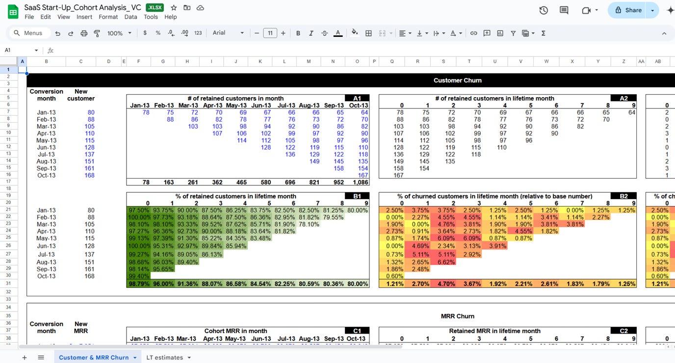
This is where you spot Month-2 or Month-3 cliffs and where you compare older and newer cohorts at the same age. You can also filter or duplicate this view by plan, region, or segment to find where stickiness lives.
Why it matters: logos tell you if users keep showing up. If one cohort is collapsing while the average churn looks stable, this table reveals it fast.
3) Revenue Cohort Table
This is the MRR cohort table. It tracks monthly revenue from each cohort and calculates Gross Revenue Retention (GRR) and Net Revenue Retention (NRR). The revenue heatmap highlights contraction or growth.

If expansions offset churn, NRR climbs above 100 percent even when logo counts fall. If GRR trails logo retention, you are losing heavier spenders.
If GRR is strong but NRR is flat, you have limited expansion motion. This matters because dollars are the truth, and the revenue view shows whether product value deepens over time and whether pricing and packaging capture it. This is the core of a real SaaS retention analysis.
4) CAC and Payback
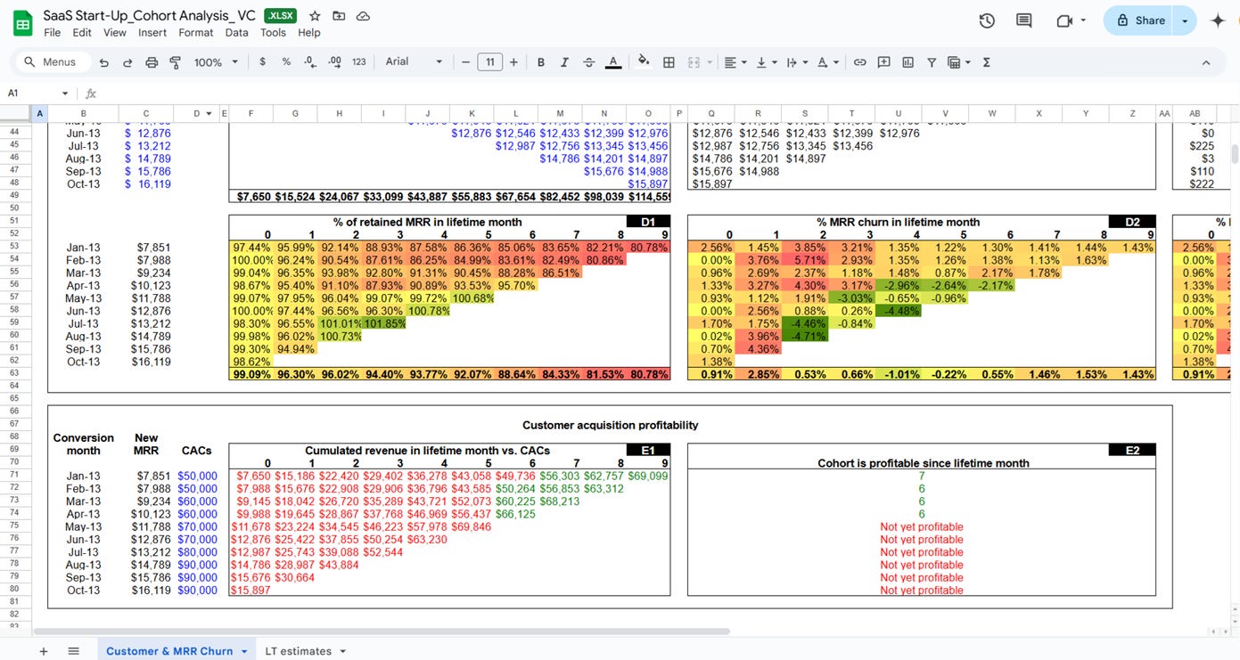
Here the model compares cumulative revenue per cohort to the acquisition cost you supplied and returns a single outcome: payback month or not yet profitable.
You can see which cohorts recover CAC quickly and which stay underwater. Pair this with channel tags in your inputs to link payback speed to acquisition source.
Why it matters: payback is the bridge between growth and economics. If payback stretches beyond your cash runway, you need better channels, pricing, or onboarding. This is also where you validate SaaS CLTV vs CAC in practice, instead of a static formula.
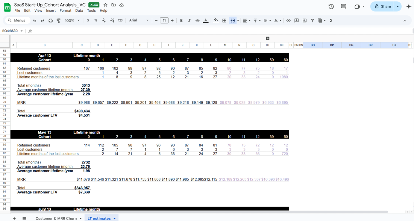
5) Lifetime and LTV
The lifetime view converts observed retention into an average customer lifetime for each cohort and then multiplies by Average Revenue Per User (ARPU) and expansion patterns to produce cohort-specific LTV.
It is retention-adjusted using your real curves, not a single assumed churn rate. The result is an honest LTV that changes as your cohorts improve.
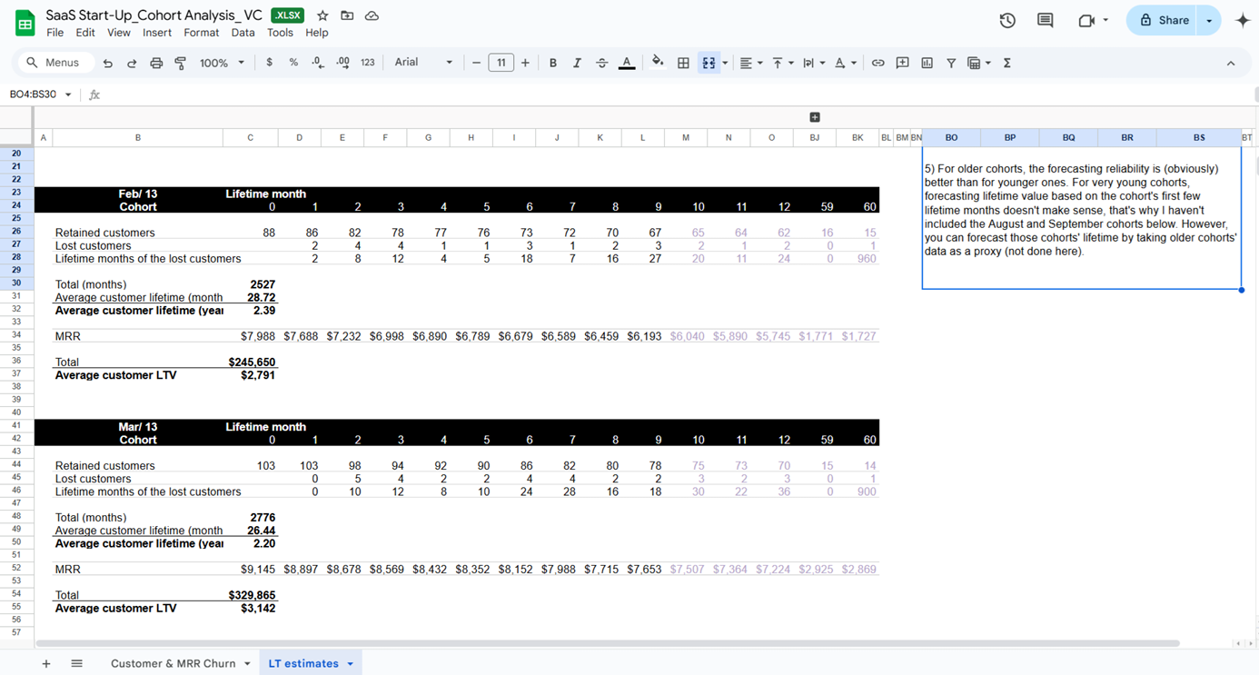
Why it matters: steady-state LTV estimates can flatter weak retention. Cohort LTV tightens the loop between product work and value creation and makes your CAC payback target concrete.
How the pieces work together
Start in Inputs to confirm the month’s data.
Scan the Customer Cohort table to find drop-offs by cohort age.
Jump to the Revenue Cohort table to see if expansion offsets those losses and to read GRR and NRR.
Open CAC and Payback to check recovery speed and cash efficiency.
Finish in Lifetime and LTV to see whether improvements are compounding.
A quick example ties it together. January brings 80 customers at an entry ARPU of 40. By Month 3, 58 remain. The customer table indicates a mild early drop.
The revenue table shows NRR at 106% , so expansions are working. Payback hits at Month 6, which clears a common benchmark for early stage. Lifetime climbs in later cohorts after an onboarding rewrite, and cohort LTV rises in step 5.
In a pitch deck, that sequence becomes a clean story: fewer early losses, stronger dollars per logo, faster recovery, healthier LTV. That is exactly what an investor wants to see and what an operator needs to run the business.
The template keeps the surface area small and the signals obvious. You get the core cohort views, the revenue lens that proves depth, the recovery checkpoint that protects cash, and the lifetime math that connects today’s retention to tomorrow’s enterprise value.
Download the SaaS Start-Up Cohort Analysis Template
In SaaS, vanity growth is easy to fake. But durable growth is not. Cohort analysis is the difference between a company that looks healthy on the surface and one that actually compounds value.
Download the Excel template now and start proving that your SaaS growth isn’t just fast, it’s built to last (how to use it guide included) 👇
You’ll also get access to all resources (50+) listed here
Keep reading with a 7-day free trial
Subscribe to The VC Corner to keep reading this post and get 7 days of free access to the full post archives.


